Tailoring your form’s design is key to creating a seamless user experience that aligns with your brand identity. The Styles Tab in the form builder provides a wide array of options to modify the visual aspects of your form, including layout, colors, and advanced design elements. With these tools, you can ensure your form is both functional and visually appealing.
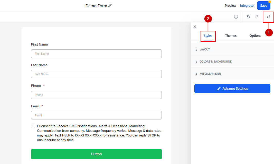
To access the Styles tab, click the “control” icon at the top right corner of the form builder.
Layout
Here you will find your form layout settings, meaning how the fields will be spread across the form.
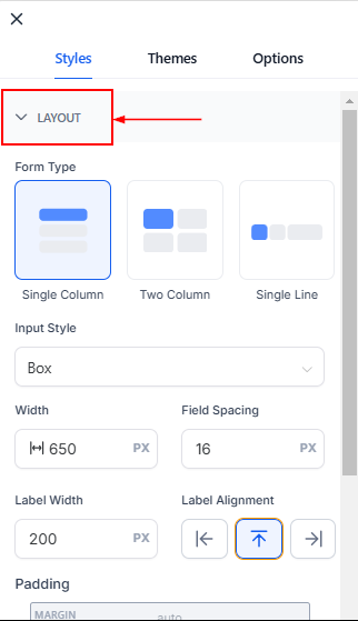
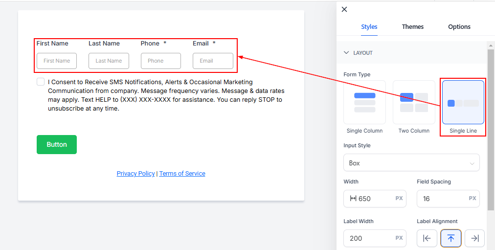
Form Type
The form type will be the orientation for the fields. The three types are:
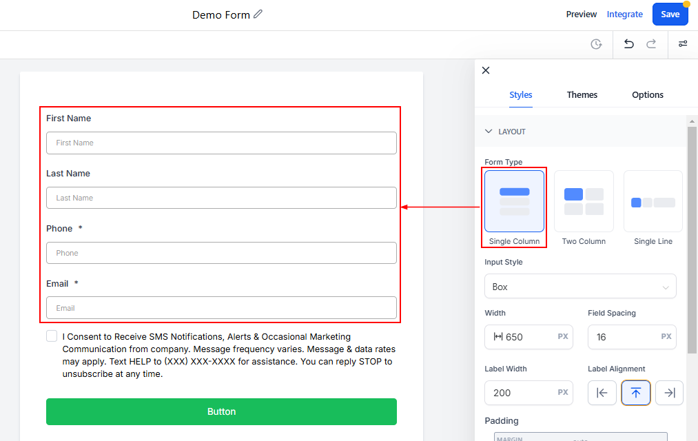
- Single Column: This will be a vertically streamlined version of the form, all fields will have a width of 100%
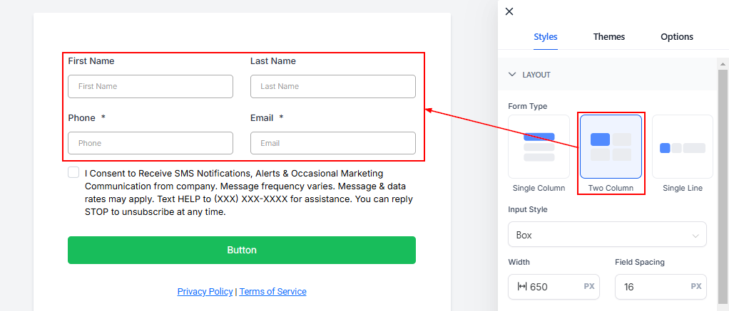
- Two Column: This will break down your fields into two columns, the split between fields will be 50% by default.
- Single Line: This will have as many fields as possible in a single horizontal line, this version allows you the most control over how many fields and how wide they are inside the setup.
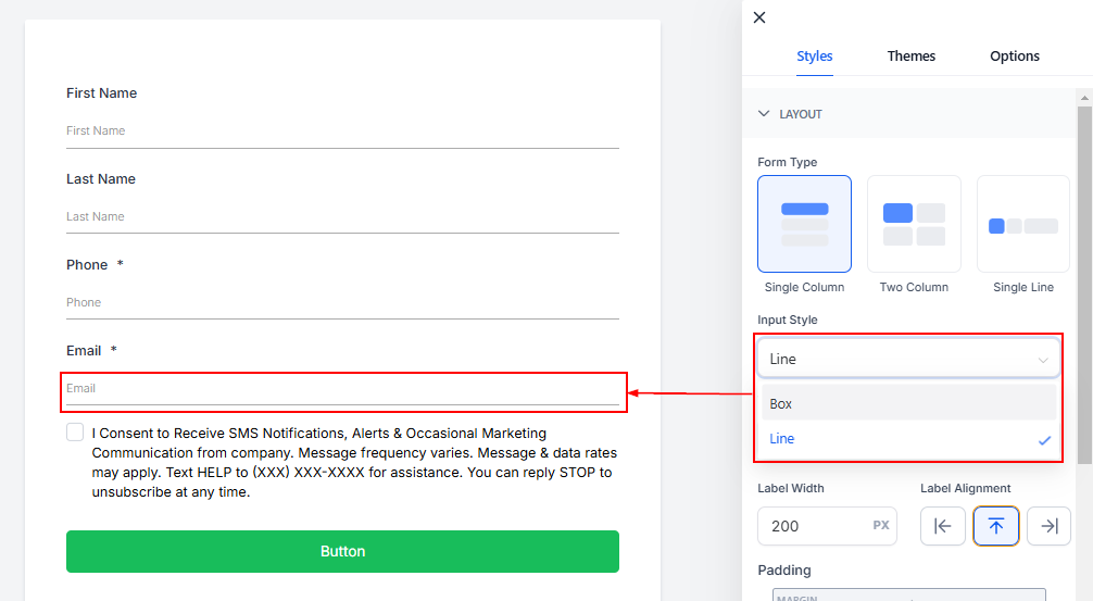
Input Style
Adjust the appearance of the input fields to enhance readability and aesthetics.
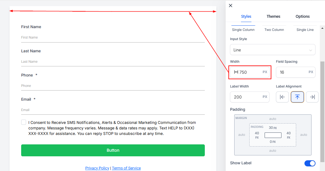
Width
Control how wide the form appears by entering a numerical value. Larger numbers result in a broader form.
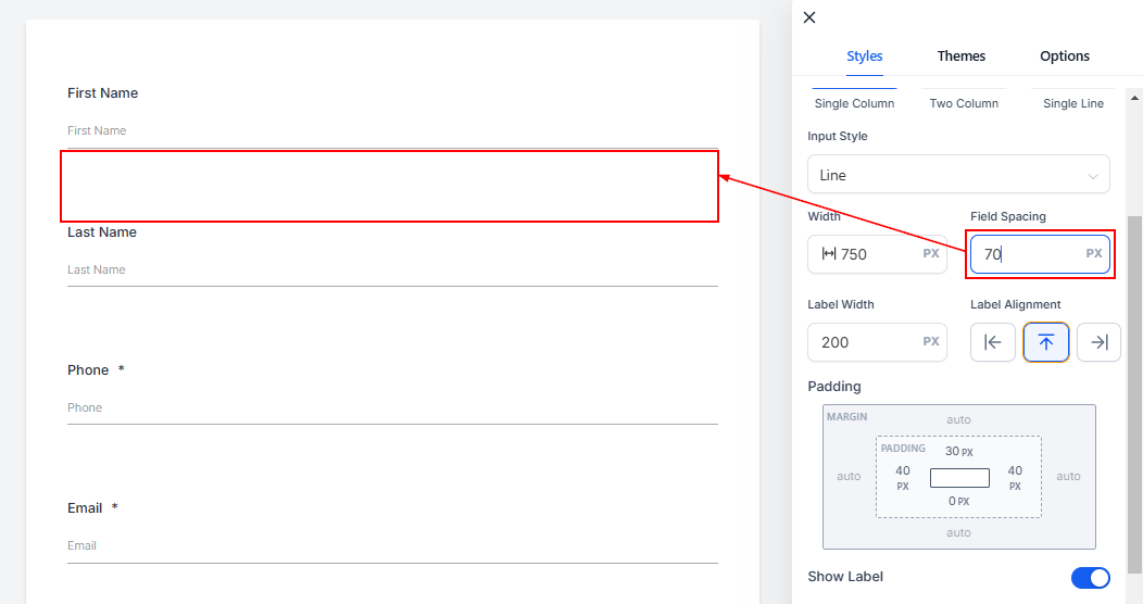
Field Spacing
Set the distance between fields by specifying a value, ensuring they’re well-spaced for a clean look.
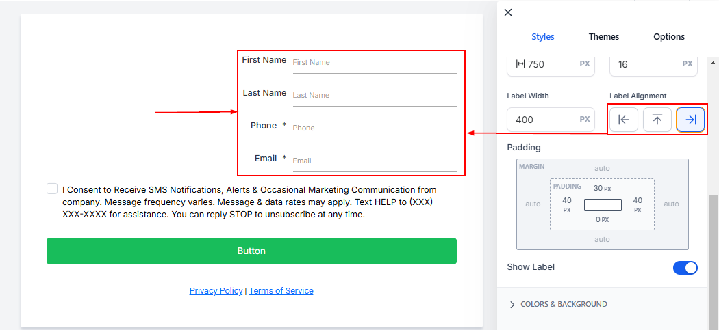
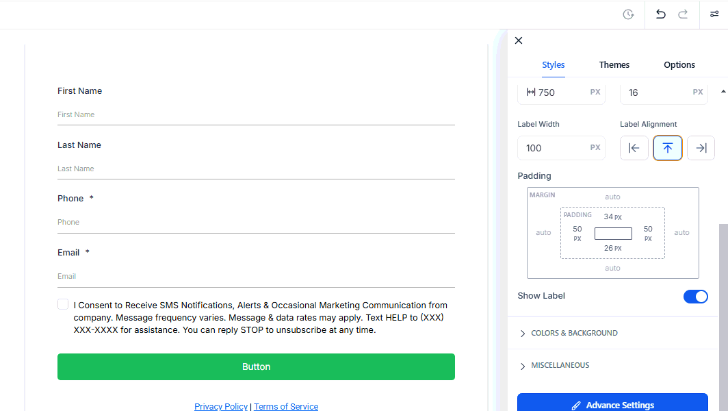
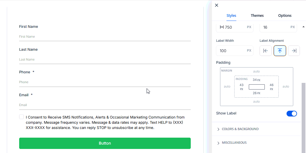
Label Width
Specify the width of the field labels for consistent alignment.
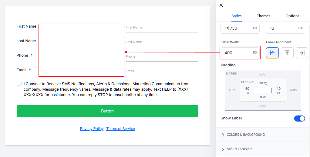
Label Alignment
Align field labels to the left, center, or right based on your design preference.
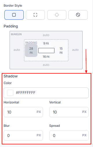
Padding
Add spacing around the form’s edges to ensure elements aren’t too close to the margins. Enter values for top, bottom, left, or right padding to customize.
Show Label
Toggle this option to hide or display field labels. Disabling it results in a minimalist design.
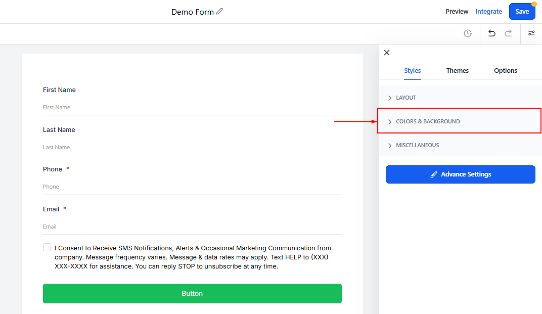
Colors & Background
Click the dropdown to configure the Colors & Background of the form.
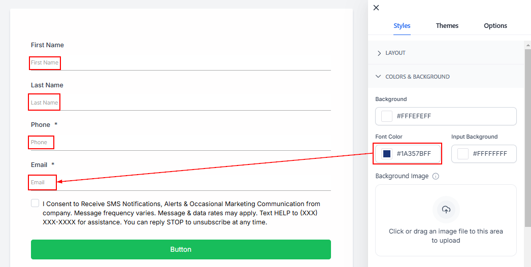
Background
Change the form’s background color by selecting from the palette or adding a custom hex code. This will affect the general form's background.
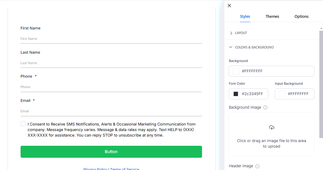
Font Color
This will modify the font color user responses have when data is entered. You can see it by previewing the form.
Input Background
This will change the background color for the response fields.

Background Image
The background image is intended to cover the entire page, providing a visually appealing backdrop for the form.
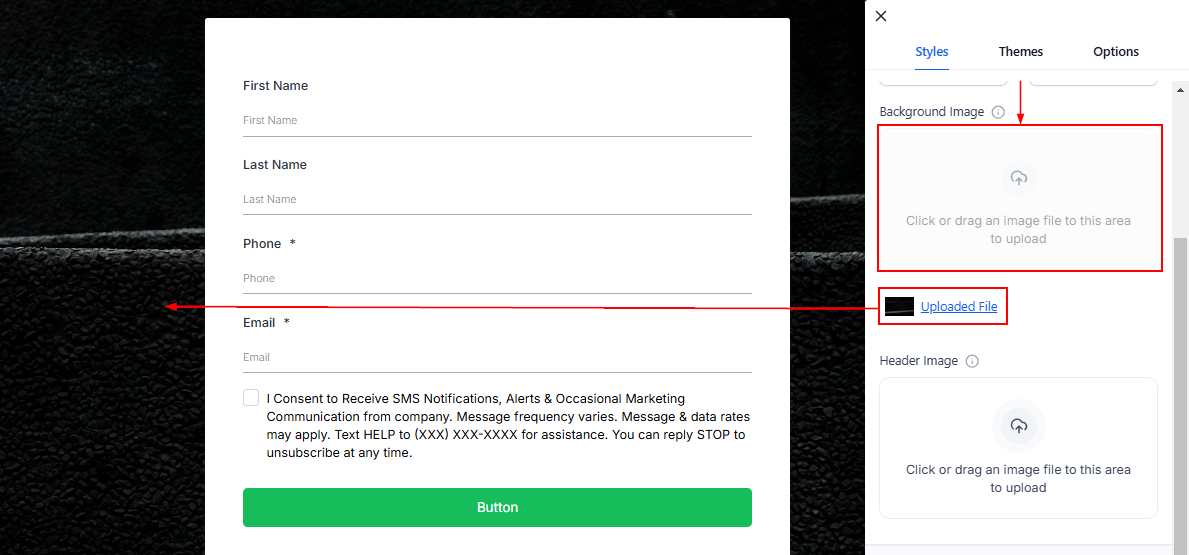
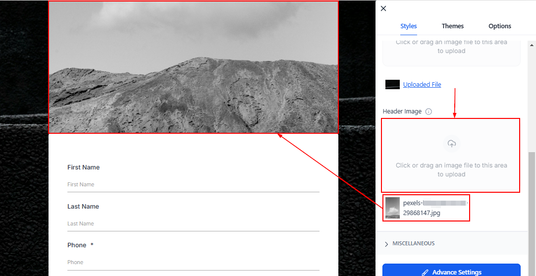
Header Image
The header image is designed to cover the entire form's width and remains at the top.
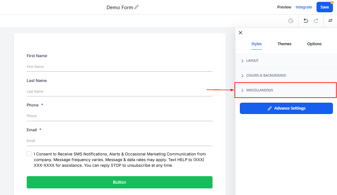
Miscellaneous
Click the dropdown to configure the Agency branding within the form.
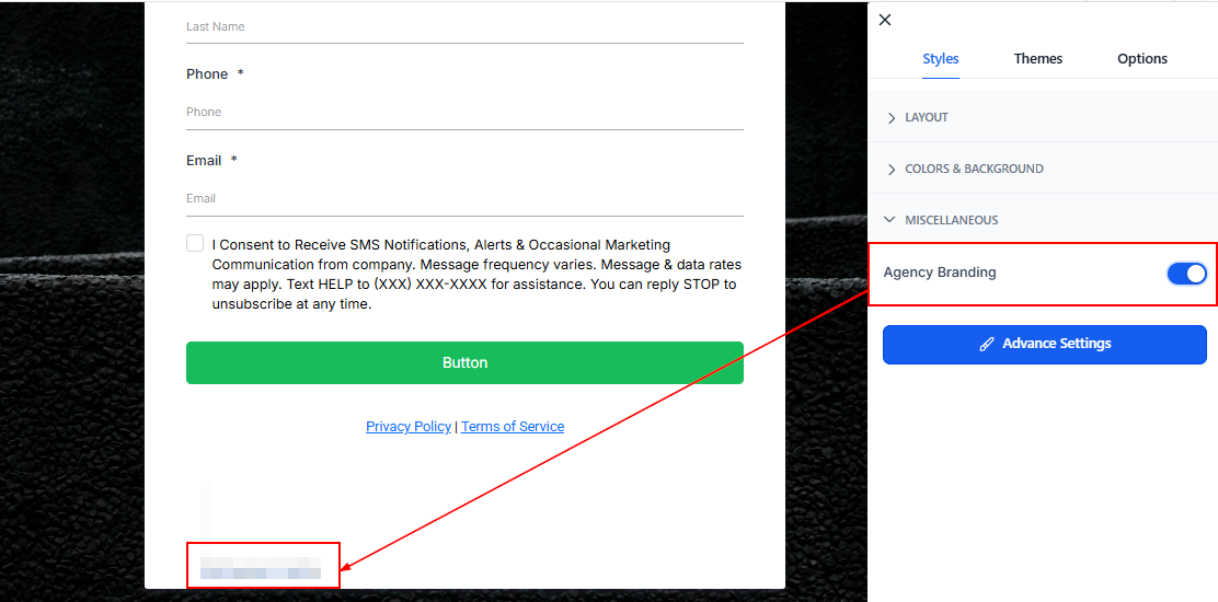
Agency Branding
In the Miscellaneous section, toggle on or off the company Branding option to show or remove agency branding at the bottom of your form. Turning it off allows you to place your form on a different funnel from the agency's.
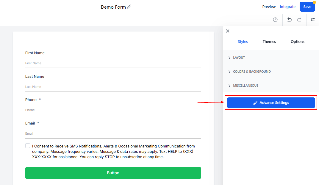
Advanced Settings
Here you can configure the look of the forms further, allowing you to get detailed with your changes.
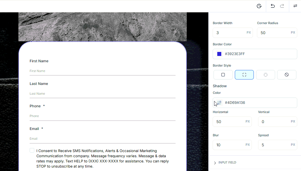
Form
This allows you to modify the look of the borders and surroundings of the form and its input fields. The modifiable options are:
- Border Width: To add thickness to the border lines.
- Corner Radius: To round the corners of the borders, you get a rounder corner the higher the number you input.
- Border Color: This allows you to modify the color to your liking.
- Border Style: Here you can modify the look of the border or remove it altogether.
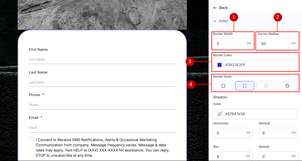
Add depth to the form by adjusting shadow settings:
- Horizontal/Vertical: Set the shadow’s size and direction.
- Blur: Control the shadow’s opacity.
- Spread: Define how far the shadow extends.
Input Field
- Font Color: Change the font color for text entered into the fields.
- Active Tag Color: Highlight active fields with a specific color.
- Border Width: Adjust the thickness of the field borders.
- Border Color: Select a border color for input fields.
- Corner Radius: Round the corners of the fields for a modern look.
- Width: Set the width of individual fields to control their size.
- Border Style: Choose a style for the field borders or remove them altogether.
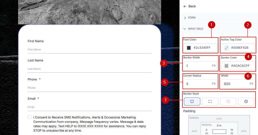
- Field Padding: This adds space between fields to prevent overcrowding in the form.
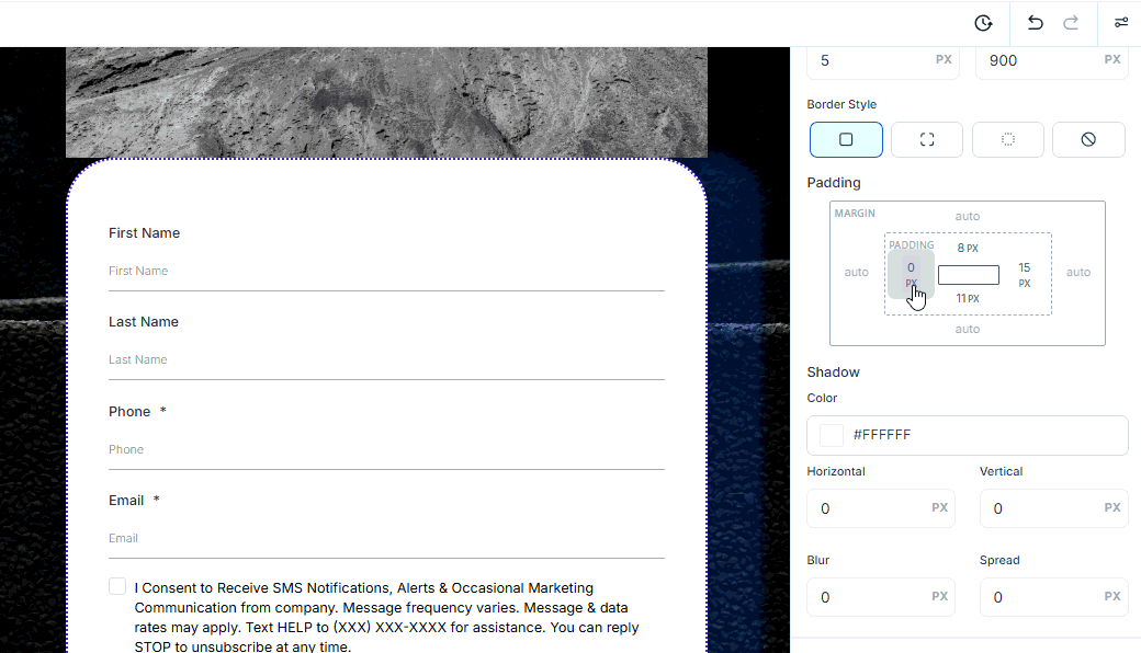
- Shadow: Enhance depth by applying shadow effects to input fields.
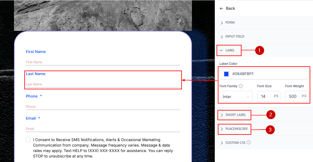
Label, Short Label, and Placeholder
These sections allow you to change the font, color, size, and weight of the text inside the Form.
- The label will appear on top of a field.
- The short label will appear underneath.
- And the placeholder will appear inside a field.
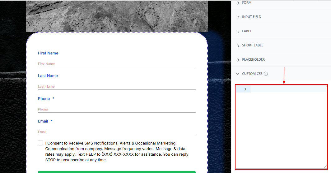
Custom CSS
For advanced design modifications, add custom CSS code. This allows you to tweak shapes, colors, and other design elements. Consult a web developer if you’re unfamiliar with CSS.
The Styles Tab in the form builder empowers you to design forms that are as functional as they are visually appealing. By customizing layouts, colors, and advanced features, you can create forms that not only meet your needs but also align seamlessly with your brand’s identity.
Was this article helpful?
That’s Great!
Thank you for your feedback
Sorry! We couldn't be helpful
Thank you for your feedback
Feedback sent
We appreciate your effort and will try to fix the article